%20_35.jpg)

Guidance for seniors with dementia


Oro is a reminder system that
gently guides seniors through
periods of disorientation in
the early stages of dementia.
Spring 2026 - 3 weeks
Group project with Tishya Maini, Johanna Huse & Helen Frank
(Product interface redesigned independently post-project)
Software: Rhino, Solidworks, Keyshot, Figma
Contributions: ideation, form exploration, interface design,
video design, surface and hardware modeling, visualization


Forgetting what you want to do.
Forgetting where you are.
Feeling scared and confused.
Early stage patients want to keep their independence but experience
moments of forgetfulness that
shake their confidence.
Video clips from Still Alice (2014).


Forgetting what you want to do.
Forgetting where you are.
Feeling scared and confused.
Early stage patients want to keep
their independence but experience
moments of forgetfulness that
shake their confidence.
Video clips from Still Alice (2014).
Early stage patients want to keep their independence but
experience moments of forgetfulness that shake their confidence.


Forgetting what you want to do.
Forgetting where you are.
Feeling scared and confused.
Video clips from Still Alice (2014).

How might we help them regain
familiarity & security in such moments?
How might we help them regain
familiarity & security in such moments?
“You couldn't convince
him to do anything he
didn't want to do.”
Rashmi Haritwal, caregiver
=
Gentle, suggestions
not instructions.
“Dementia strips away
so many tiny moments
of independence.”
Wendy Mitchell, patient.
=
Non-surveillance,
user maintains agency.
“For us, routine and
consistency became
very important.”
Andreas Estensen, caregiver
=
Dependable, anchored
in user's daily routine.


How might we help them
regain familiarity & security
in such moments?
How might we help them
regain familiarity & security
in such moments?


The form and interaction were
developed through rounds of
iteration, testing and discussion.
Prototyping first in foam and then in CAD
and 3D printing, we worked as a team to
assimilate a shape for the product that felt
domestic, inviting and non-medical.

With interface, branding and
CMF carefully chosen to match.
We worked carefully and meticulously
to pick color and material choices for
the details that would enhance the
form language of the product.

Here's a deeper look
behind the scenes.


The interface helps users reorient themselves through open-ended
exploration of daily activities in a non-pressurizing manner.


Press the button.
Turn the knob.
The simplified and tactile interactions reduce confusion.

A range of backplate options allows
for seamless multi-room setup with
both wall-mounted and tabletop use.
Customizable setup to match
each user's unique lifestyle.
Video clips from Still Alice (2014).

Simplified, tactile interactions to reduce confusion and increase groundedness.


How might we extend Glossier’s visual language
to the realm of consumer electronics.
gentle / dreamy / inviting

Quick ideation taking inspiration from Glossier's existing products.

Concept Deck:
Final direction selection

A mobile phone and
a beauty accessory.


Gentle Form.
Every aspect of the surfacing and detailing was meticulously considered to create a soft, organic and memorable form.

Dual Colorways.
I explored a signature tone-on-tone pink option for the brand’s iconic aesthetic and a white and silver option for users who prefer a more neutral look.

A new addition to the Glossier family.

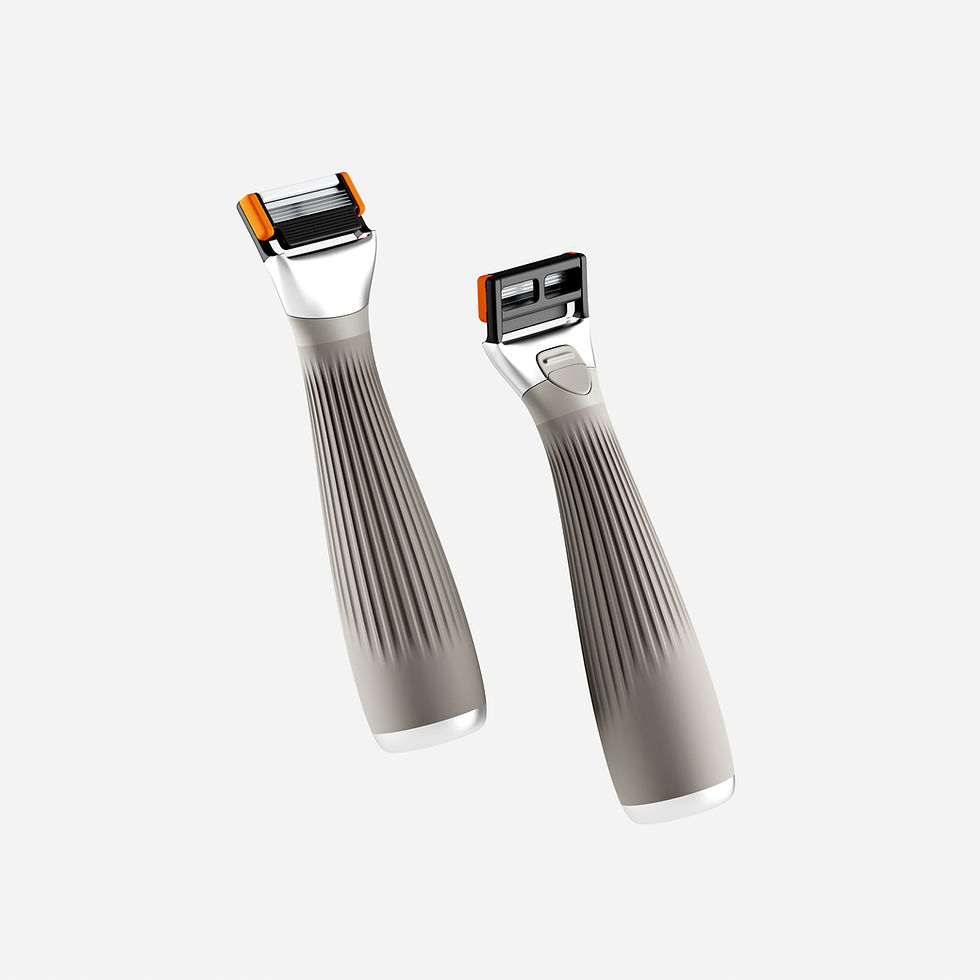
Safety First
Bright colors indicate safe
touchpoints so you can handle the
razor head even without glasses on.

%20.jpg)
%20.jpg)
%20.jpeg)
%20.jpg)